No. 4 Good Enough to Eat

JennaBechtholt_FloralTutorial_1

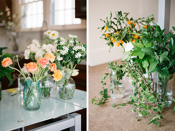
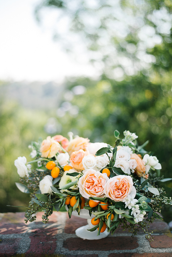
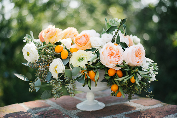
What does this remind you of?  Summer, fresh, crisp, citrus, divine!  I just adore the rich greens mixed with the pale peaches & creams, and the vibrant, almost electric orange.  If you want to create this look yourself, Jenna Bechtholt from Emblem Flowers has laid it all out for you, step by step.  Amazing right?!  Not only would this arrangement compliment any summer soiree, it would also mesh great with a fall or even thanksgiving table setting!  See below for her detailed instructions! Have at it friends.

JennaBechtholt_FloralTutorial_2

You’ll need: Urn or Bowl / Floral shears / 6 stems of garden rose /10 stems of ranunculus in various colours / 10 stems of spray rose / 6 sprigs of kumquats or seasonal berries and fruit / 6 stems of seeded eucalyptus leaves / Floral pin frog or chicken wire shaped into a ball / Floral adhesive tape to secure the pin frog to the centre of the bowl.

1) Build a base using sprigs of kumquats or seeded eucalyptus leaves. Use 3 sprigs to form a triangle and cut them at the length where they will rest at around the same height as the edge of your bowl. Form a cuff around the entire bowl. Insert a heavier sprig at the centre of the bowl. Start building out the arrangement with longer pieces of greens by forming other triangles.

2) Position the large garden roses as your points of focus where they can be clearly seen within the arrangement. Cut the stems at different lengths where some stems come forward and some stems recede.

3) Position some shorter stems of spray roses behind the garden roses. Fill in the rest of the arrangement using ranunculus and spray roses and build up the center. Work on both sides of the arrangement. Leave space in between each bloom to allow the flowers room to “breathe”.

4) To finish, add the more delicate and wispy elements to give the arrangement a greater sense of natural movement. Use ranunculus or vines that look like they’re reaching out towards the sunlight or spilling out of the bowl.
JennaBechtholt_FloralTutorial_12

JennaBechtholt_FloralTutorial_15


No. 3 Broadening My Horizon

I’m not a huge fan of purple.  Maybe it seems a little unnatural or fake looking to me sometimes but this following shoot by some crazy talented French people is making me change my mind.  The purple is so feminine and dainty and matches like a dream with the cremes, antiqued pinks and subtle greenery.  Not only do these pictures make me all goose pimply, there is an even more goose pimply video to go along with it!  It makes me feel like i’m inside Hameau de la Rein at Versaille.  *sigh*

ROSY. L’ATELIER DE LA MARIEE | Mymoon from Estelle Beauvais on Vimeo.

P.S. I’m super into these floral crowns right now.  We are making one ASAP.


I mean…perfection.

Photographer: Pierre Atelier / Videographer: Les Films d’Estelle Beauvais / Design: Mymoon / Flower Design: Les Fleurs de Pauline / Hair & Makeup: Estelle Makeup / Stationery: Rouge Pompon / Dress:Harlow Paris / Shoes: Dessine-moi un soulier / Jewels: Paulette à Bicyclette / Model: Rosy

No. 2 …I can’t…

I can’t…I mean, seriously?  Ombre florals, bohemian design, etherial whimsy (does that go together?!)…it does for me!  I’ve fallen head over heals for gradient and ombre florals ever since I saw Martha (yes, we are on a first name basis) do it like 10 years ago.  This shoot by the  Mirelle Carmichael + Noonan’s Wine Country Designs is one to save in your inspiration books for future reference, or daily reference, or hourly…you decide.  THIS is crazy beautiful!

More from Mirelle on her creative inspiration: The Dana-Powers Barn is one of the most popular venues along the Central Coast. We played on a palette of corals and reds with rose gold accents and dressed our bride in an alternative wedding gown: a pale blushWatters skirt courtesy of The Lovely Bride LA paired with a cropped tank and loads of gorgeous accessories. The bridesmaids wore shades of coral (dresses courtesy of Shop Lovely) and complimentary accessories and hairpieces.

Katie, of Noonan’s Wine Country Designs, was inspired by the gorgeous coral charm peonies that are stunning this time of year (May). With the ombre notion of going from light to dark, which was peach to red for this shoot, Katie put coral right in the middle of the spectrum as the show stopper. Red tones were brought in by beautiful garden roses, ranunculus and sweet peas. The touches of the rose gold on the foliage were subtly added into the designs with the use of the brand new Rose Gold color by Design Master spray paint.

No. 1 Let’s Get Real People

Blog entry numero uno should pretty much include everything we love about what we do.  Flowers, flowers, flowers and more beautiful flowers.  Could you ask for anything more?

I mean would you literally just melt sitting at this table?  From the garden roses to the peonies and let’s just talk about the two-toned pink ranunculus just chillin’ right there in the middle.  Have I ever seen a two-toned pink ranunculus in person you ask?  No.  Would I like to?  H, E, to the double hockey stick YES!  But for real, throw some perfectly pink macaroons in some bone china tea cups and you have a recipe for visual goodness.  It’s the little things in life, right?